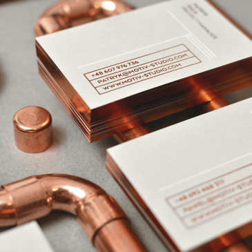
C speaks for counterform | Casa Amella Package Design by Requena

A glimpse of a taste & visual relish. The new package design of Casa Amella food products uses counterform in quite a smart way – enriching the typo labels and using the food texture Designed by Requena Powyżej: design opakowań dla Casa Amella to udany przykład użycia counterformu – wycięta litera C pokreśla teksturę produktu i nadaje typografii smaku … More C speaks for counterform | Casa Amella Package Design by Requena

3 x BEST: 3 Best Marble Pattern Brand Identity Designs for September 2015

Spotted at many trend festivals & projects, marble is an elegant pattern with multiple options to incorporate into interior, furniture and graphic design. Just have a look at the 3 chosen examples that I find absolutely amazing: 1/ Charly Gusto marketing professional brand identity design by mubien studio. Strong colorful pattern, elegant classic typo & a witty signet … More 3 x BEST: 3 Best Marble Pattern Brand Identity Designs for September 2015

Entremanos Wine Brand Identity & Package Design by Análogo

The clean and modern identity along with abstract monotype prints made exclusively for each label and inspired on the taste and terroir of each wine express the character and uniqueness of each bottle. Simple signet & rich painted texture. Classical typo mixed with a atron geometric font. Warm and dynamic. Supercool. An unique brand identity & package design … More Entremanos Wine Brand Identity & Package Design by Análogo

Minoan Life Natural Olive Oil Soap Package Design by leftgraphic

  (We’ve) created graphic elements for each place, such as Naxos’s windmills or Kos’s ancient agora, elements that reflect simplicity. Those packages for Greek natural oil soaps are pretty special – they reflect the region of origin, the greek colours, their contrast & a strong typography. It all makes a cool, rememberable project by leftgraphic